Monday, 26 January 2015

MONDAY BLUES

A bit of blue for this grey Monday in London.


Take me back to Rabat in Morocco, the vividness of the blue buildings are just phe-nom-en-al. They actually paint their homes in this blue to repel mosquitoes. Apparently mosquitoes don't like blue. Fools. I do.


These are the ways in which I like blue most;


Blue with pink. Baby blue and baby pink. Bring me a newborn baby now. 


Navy blue and white. Royal Dolton got something right. 


Blue and lemon yellow. There's just something so happy about this space. I want to put a very loud Spice Girls track on (preferably a tune from the first album) and dance in this room. 


Blue accents. The blue in this kitchen just lifts the space so effortlessly. It could have been boring and  rather forgettable. But the crockery just adds some pops of colours that work so bloody well with the greyish wood and the marble. 


This photo is blurry. Such a sad thing. But the blue stripe in the doorway is such a genius idea. It makes you want to head on in to that other room, he's like the more exciting brother of this grown up space.... Very well done. 

 Blue tiles. Even with a chrome tile trim (a personal pet hate of mine) these tiles are perfection in this space. So subtle and intricate but so punchy at the same time.

Blue watercolours of any description are fine with me. 


Squid ink blue. Blue food is rare kids, this one makes the cut. That plate... 


Yes. Just yes. 

Oh and one for good luck. This is a neon writing that I created and sourced from NeonCreations in a house that I designed for a client. I was wary about the blue Bryn, i'm not gonna lie. 


It actually couldn't have worked better, it was so soft, but also a real statement that looked so god damn cool. 

The sad thing about this photo is that I filled the water jug half full and it clashes with those empty glasses. If I had a time machine this would be the first thing I used it for to put things right. I am a sad individual.  


Wednesday, 21 January 2015

CANE CHAIR CRUSH

I love cane chairs. Or rattan. Not always the most bum friendly, but I literally couldn't care less.

I'm looking for some inexpensive bad boys for the flat, but I just can't seem to come up with anything that i can afford that doesn't look like something out of my grand parents garage.

What I want;


What my grandparents are likely to offer me;


Very lol as this is the exact kind of sorry-for-itself, horded good they would insist I take from their garage, on the train home, for my flat. Along with the remainder of the trifle and some glass paints to protect the birds from flying into my windows (they do not understand that birds do not exist in London) 

So I've be a-searching. And this, friends is what my extensive internet search retuned with;    
Fek. 

One must never be defeated by google. 

A few moments later this is what i'm in the process of ordering.... 


And this


I'm gonna get me some cane chairs, and i'm going to relive the whole process on here.... Watch this space.....

Tuesday, 20 January 2015

HALF PAINTED WALLS - I NEED TO TRY THIS

The half painted wall. I must do this. Now. It is sick.

Visually it creates interest and breaks up a room. It can actually make a room seem higher because it takes the eye upwards. If you have a low ceiling (below 2.5m) try 1/2 neutral darker on the bottom and go lighter on the top otherwise it will feel too heavy and won't work. Don't make the split over 50% of the way up the wall if your home is on the lil' side.

If you have the luxury of high ceilings knock yourself out in terms of proportion. I'm thinking a grey, something like The Little Greene Lead colour (117)  on 75% of the way up and then a bright but warm white on top. Take this girl to Homebase.

Check out my inspiration


All sources on my Pinterest board 

Thursday, 8 January 2015

WHAT A DIFFERENCE A DAY (OF LABOUR-INTENSIVE STYLING) MAKES

Just a quickie. A before and after styling shot that shows just how much the 4am trips to the flower market, the obsessing / dreaming about which wooden bowl to use, the styling and re-styling, and re-re-styling can change the look of a space. Enjoy. In particular enjoy the thin layer of builders dust my i phone seemed to have on its lens.

BEFORE


AFTER 


Thankfully i'm lucky enough to work with the best photographer ever who helps to create these  images of beauty. As you'll notice we sneakily touch up a few ugly things like the smoke alarm (aint' nobody wanna see that) and altered the light and contrast which actually is far more true to life on the colours and tones.

I'll talk through the design of this kitchen on another post but so-long for now.

Tuesday, 6 January 2015

NAVY BLUE WALLS WITH BALLS

Which deep navy blue paint to use?


Navy is big now, it’s HUGE. It requires balls. Huge balls. Balls with bells on. But if you dare, the risk is worth the trip. 


Rules of slapping that inky blue hue all over your walls; 

1. TEST. It is a criminal offence not to test the actual colour in multiple places (on walls, generally) where you’ll be applying it. Rooms change in colour so much from natural light during the day and at night artificial light can have a huge affect. I usually try three walls (facing different directions) and look at them over at least 48 hours… in every type of light / time of day. 

2. Decorators Caulk - use it. If you have an old property or the walls are less than perfect use masking tape (low tack people, always use low tack or else the other paint will be ripped viciously from the walls) and afterwards use a decorators caulk to make the edges perfect. It’s sort of like a mastic that you would use in a bathroom but it’s more a filler / putty to make the edges perfect. Obviously only do this where a coloured edge meets a white edge…. plonker. 

3. Brush it don't roll it. Rollers give a stippled (stipple = gross word) effect application which is fine on light colours as it's not quite so noticeable (maybe it's the light) but to get a really rich, matt application you need to use a real good quality brush. Don't be a stinge on this, get the best you can afford. It will take longer, but dark colours and dramatic walls deserve respect. 


My favourite EXTRA deep blue paints (squid ink if you will)


1. MOTT BY ABIGAIL AHERN 
She’s not cheap but she’s pretty perfect. WARNING: you will open the tin and as our American brethren would say 'freak-the-hell-out'. It looks turquoise, and a rank turquoise at that. You need to man up and get two coats of the good stuff on the walls. See? Despite the dubious look of the paint once it’s on the walls, it’s really deep and is almost black - blue. It’s smokey, if that makes any sense.

2. HAGUE BLUE BY FARROW & BALL 
A staple used by the yuppies across West London. In some parts of Nappy Valley entire streets paint their front doors in this, it signifies that the annual income of the tenant is circa £150k and that the only foods they will allow int their homes / mouths are organically produced, raw delicacies from the local independent grocer on Westborne Grove….. well of course except those marlborough lights. Anyway, a nice colour none the less. It has a hue of green in it, which, in the right light becomes ever so slightly teal-y, but it has a real depth that makes it perfectly flat and matt on the walls. It’s a pretty penny mind you and my decorators hate using the stuff. It takes AT LEAST two coats to manage a perfect finish especially in the darker colours which is why I always colour match Farrow and Ball colour books at Dulux counters (arrest me).


3. CARBON BLUE BY FIRED EARTH
A slightly chalky shade, it’s got very little green pigment (as far as my humble eye can tell) and it’s not too dark and scary either. It has a lightness to it.


4. DULUX.....
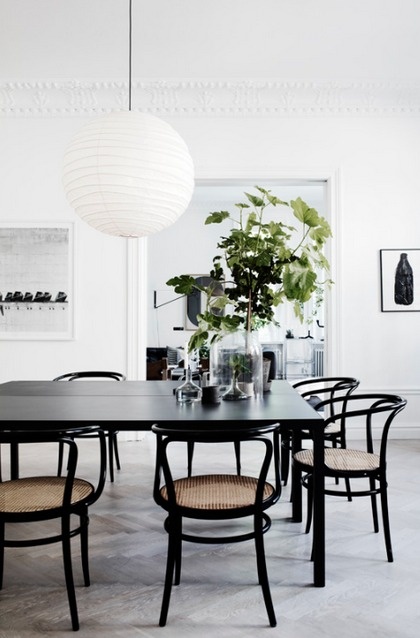
self made my yours truly (at at least matched with something I can’t recall!) Are you ready: Code: 10BB071008/10. That’s exactly what the tin says.  Anyway check out the use of it below in a (you guessed it) Notting Hill pad I recently worked on. It's almost blue black, really inky and rich and deep and sexy and smokey and PURE PERFECTION. The client didn’t want to much so we compromised and did the dining area part and the bulkheads in the kitchens - which sets off the white kitchen so good. In my opinion, hell yes I would have done those back walls too but… you live and you... regret.

 (As below)


Thursday, 4 December 2014

CHRISTMAS GIFT GUIDE: THE SCANDI-INSPIRED LOVER OF INTERIORS


What to get for the mid-century loving home maker? The laid back but uber slick hostess with the mostess? Well look no further lads, these are currently on my wishlist (read = in my handbag / car / hidden in cupboards for myself) and they are just Sooooo good. 

Everyone needs a coffee table book. It is a life essential; along with food, water and sleep. If not more important that the former. This baby (no. 3) is B.I.G. he's probably big enough to actually destroy those cheapo £5 ikea coffee tables that we all buy for our disgusting uni digs. It also look tres intellectual, even if you never open / read it (arrest me). 


The wicker dear head (no 5) is just such a bloody good buy (£49.50 from memory) and who says a reindeer is just for christmas? This is an excellent gift choice, even if it will probably be the most difficult one to wrap. The lemon tree was last year's test, I need me a new challenge. 

The seriously affordable Dan Isaac Wallin print which I came across here  is destined for a matt white frame and to be displayed on top of this bad boy midcentury sideboard - these ebay suppliers are really good - trust. 

The & Other Stories candle (no 4) is a cheap buy but looks expensive (that's what we like) for a secret santa or a stocking filler, along with these brass fellas from Zara Home (no 1). You've done well.  

Links below kids. Don't all rush at once..... 


Monday, 1 December 2014

POPS OF PASTEL AND A BRASS HARE


This is all about the pastel. Pastel can be so … meh…. but adding some more 'refined' brass accents here - like the lil’ hare (scored him at M&S for nineteen pounds and fifty pence- thank you Marks ) removed any meh-ness at all.


I love doing kids; spaces -  they are just so much more F.U.N that standard bedrooms. Colour, pattern, texture can all be really amplified when designing for the bambinos. Having said that, this particular space was for a London crash pad -that will likely be rented out on airbnb or onefinestay (which is a posho version of the former) - so we had to restrain it in some ways. No crazy neon writing (although … ahhhh one of these babies would have been the absolute dogs in this bedroom, now i’m wishing I would have thought of that a while ago. Hindsight you rascal).

If you did want one of these guys, then look no further than Neon Creations. I've used them twice now for neon artwork for client projects and they are seriously good, and pretty competitive with prices. Neon installations do cost a pretty penny (my neon writing was 2m long in a blue and set us back £800 plus the electrician who has to install it was £250 so £1050 total) but if you see them as a pice of art (rightly so) then it's sure as hell worth the investment.


1.  Can't find |  2 . Gemma Tickle

Moving on, the brief for this bedroom was simple. I mean the actual brief was simple, as in ’a simple space which is cosy and girly but not too pink or bright with muted tones and somewhere that can be rented the hell out’ (ie no crazy-ass indoor swings and ballpits) so here's what I came up with;


And here she is. 


The photos are too dark here... however it picks up all the detail I want, including these amazing quilts from The White Company which are just adorable, and not too bright and garish like some of the floral ones I was looking at.  

I can't recommend Carpet Vista enough - the service, the quality and the choice of rugs is un-bel-iveable. Don't be freaked out by the corporate website. These guys have so much incredible stuff and also stock massive rugs (some that are actually too big for the room - guilty) . Here's a little selection;